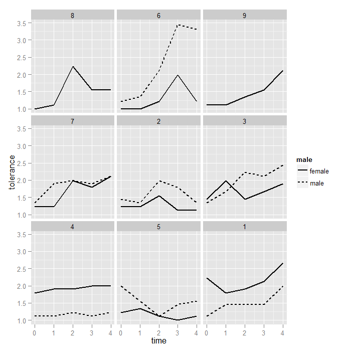
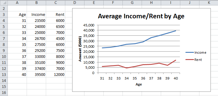
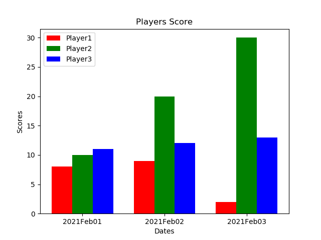
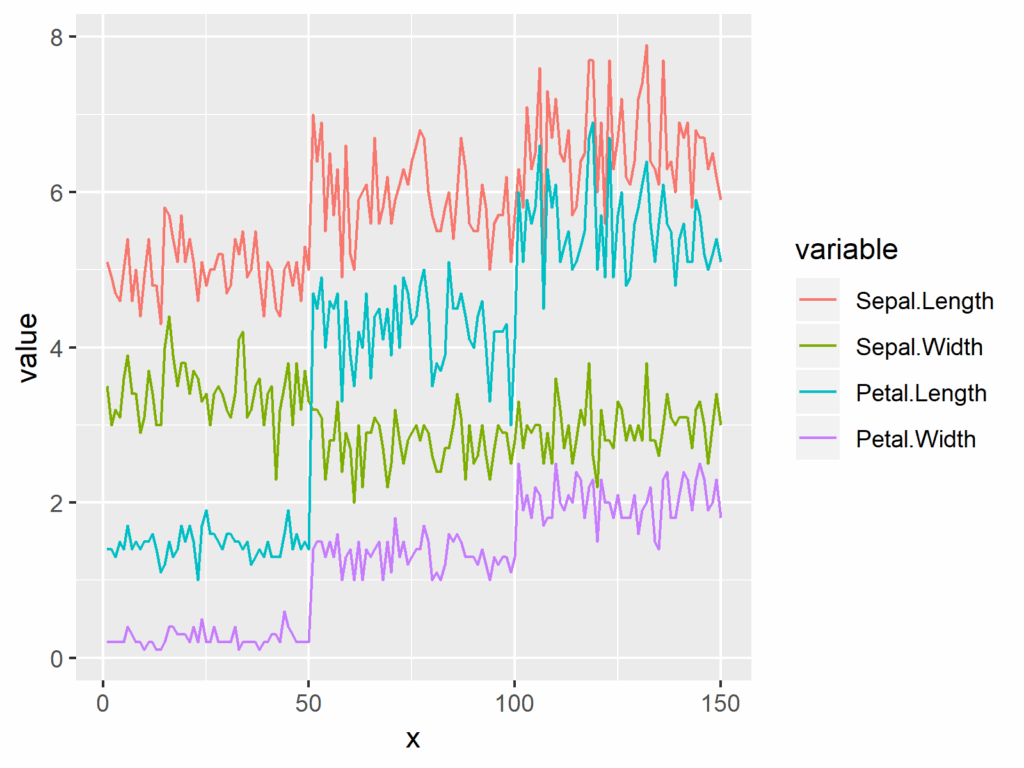
When working with data visualization in R, it’s common to want to plot multiple line charts on the same graph. This can be useful for comparing trends between different groups or variables. In this article, we will explore how to create multiple line charts in R using the ggplot2 package.
To follow along with the examples in this article, make sure you have the ggplot2 package installed in R. You can install it using the following command:
Plotting Multiple Line Charts In R
“`R
install.packages(“ggplot2”)
“`
Creating Multiple Line Charts
To create multiple line charts in R, we first need to have a dataset that contains the data we want to plot. For this example, let’s use a sample dataset called “data” that contains three variables: “group”, “time”, and “value”. We want to plot the “value” variable against “time” for each group.
Here’s how we can create multiple line charts using ggplot2:
“`R
library(ggplot2)
ggplot(data, aes(x = time, y = value, color = group)) +
geom_line() +
labs(title = “Multiple Line Charts”, x = “Time”, y = “Value”) +
theme_minimal()
“`
In this code snippet, we use the ggplot() function to specify the dataset and aesthetics mapping. We use aes() to map the “time” variable to the x-axis, the “value” variable to the y-axis, and the “group” variable to the color of the lines. We then add the geom_line() function to create the line charts and customize the plot with the labs() function for titles and labels and the theme_minimal() function for aesthetics.
Customizing Multiple Line Charts
Once you have created the basic multiple line charts, you can further customize them by adding elements like legends, annotations, and themes. For example, you can add a legend to the plot to show which line corresponds to each group by adding the following code:
“`R
ggplot(data, aes(x = time, y = value, color = group)) +
geom_line() +
labs(title = “Multiple Line Charts”, x = “Time”, y = “Value”) +
theme_minimal() +
scale_color_manual(values = c(“red”, “blue”, “green”)) +
guides(color = guide_legend(title = “Group”))
“`
In this code snippet, we use the scale_color_manual() function to manually set the colors of the lines for each group and the guides() function to customize the legend title. You can explore more customization options by referring to the ggplot2 documentation.
By following the steps outlined in this article, you can easily create and customize multiple line charts in R using the ggplot2 package. Experiment with different datasets and customization options to create visually appealing and informative visualizations for your data.
Download Plotting Multiple Line Charts In R
Line Charts With Multiple Series Real Statistics Using Excel
Plotting Line Graph
Plotting Multiple Bar Charts Using Matplotlib In Python GeeksforGeeks
Plotting In R Using Ggplot2 Plotting Multiple Plots Data A


