Excel is a powerful tool for creating and analyzing data, and one of its standout features is the ability to create charts and graphs to visually represent your data. In some cases, you may need to create charts that pull data from multiple worksheets in the same workbook. This can be a bit tricky, but with the right approach, you can easily create dynamic and interactive charts that update automatically as you add or modify data in your worksheets.
The first step in creating charts across multiple worksheets is to ensure that your data is organized in a way that makes sense for your chart. Each worksheet should contain a distinct set of data that you want to include in your chart. For example, if you’re creating a sales report with data from different regions, you may have a separate worksheet for each region’s data.
Excel Charts Across Multiple Worksheets
Step 2: Create a Chart
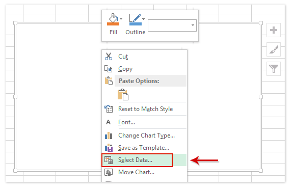
Once your data is organized, you can create a chart that pulls data from multiple worksheets. To do this, select the data range in the first worksheet that you want to include in your chart. Then, go to the “Insert” tab and select the type of chart you want to create. After inserting the chart, you can add data from other worksheets by clicking on the chart and selecting “Select Data” from the Chart Tools menu. From there, you can add data series from other worksheets by selecting the range of cells containing the data you want to include.
Step 3: Customize Your Chart
Once you have added data from multiple worksheets to your chart, you can customize it to suit your needs. You can change the chart type, add labels, titles, and legends, and format the chart to make it visually appealing. You can also add data labels, trendlines, and other elements to enhance the readability of your chart.
