Creating a pivot chart with multiple rows is a powerful way to visualize complex data sets and uncover valuable insights. By organizing data into rows and columns, you can easily compare different categories and trends within your data. In this article, we will explore how to create a pivot chart with multiple rows in popular spreadsheet programs like Microsoft Excel and Google Sheets.
First, let’s understand the basics of pivot charts. A pivot chart is a graphical representation of data that has been summarized in a pivot table. It allows you to visualize trends, patterns, and relationships within your data. By adding multiple rows to your pivot chart, you can further break down your data and gain deeper insights.
Pivot Chart With Multiple Rows
Creating a Pivot Chart with Multiple Rows in Microsoft Excel
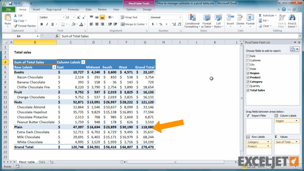
To create a pivot chart with multiple rows in Microsoft Excel, start by selecting your data range and inserting a pivot table. In the pivot table field list, drag and drop the fields you want to include in your pivot chart into the rows area. You can add multiple rows by dragging additional fields into the rows area. Once you have organized your data, click on the “Insert” tab and select “PivotChart” to create a visual representation of your pivot table.
Customize your pivot chart by adding titles, legends, and data labels. You can also change the chart type and style to better suit your data visualization needs. By adding multiple rows to your pivot chart, you can create dynamic visualizations that help you analyze and interpret your data more effectively.
Creating a Pivot Chart with Multiple Rows in Google Sheets
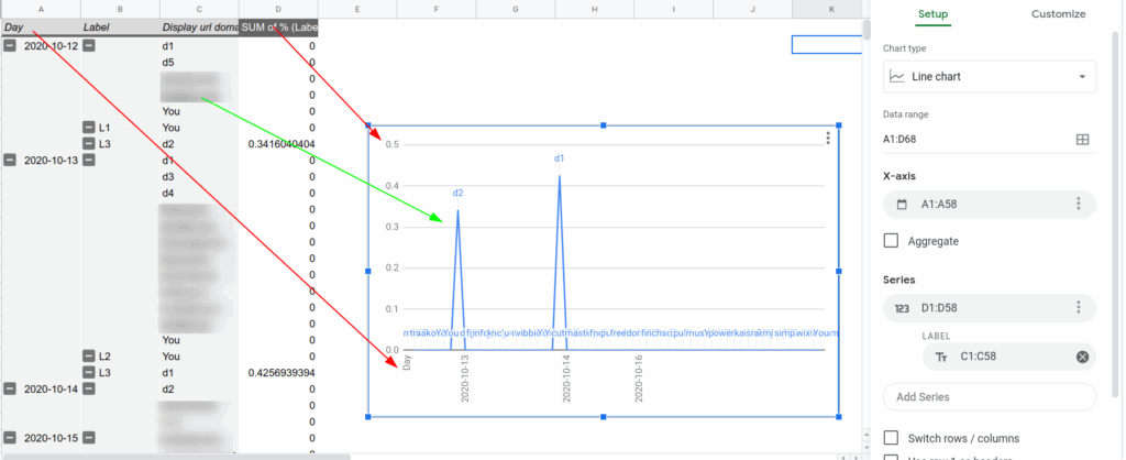
In Google Sheets, you can create a pivot chart with multiple rows by selecting your data range and clicking on “Data” in the top menu. Choose “Pivot table” from the dropdown menu and customize your pivot table by adding rows, columns, and values. To create a pivot chart, click on the pivot table and select “Insert” from the top menu. Choose “Chart” to create a visual representation of your pivot table data.
Customize your pivot chart by changing the chart type, colors, and labels. You can also add filters and slicers to further analyze your data. By including multiple rows in your pivot chart, you can create interactive and insightful visualizations that make it easier to understand and interpret your data.
By following these steps, you can create pivot charts with multiple rows in Microsoft Excel and Google Sheets to visualize your data in a more dynamic and informative way. Experiment with different chart types, styles, and layouts to find the best representation for your data set, and unlock valuable insights that can drive better decision-making and analysis.
Download Pivot Chart With Multiple Rows
Google Sheet Pivot Chart Multiple Lines 2023 Multiplication Chart
Select Multiple Rows In Pivot Table Printable Online
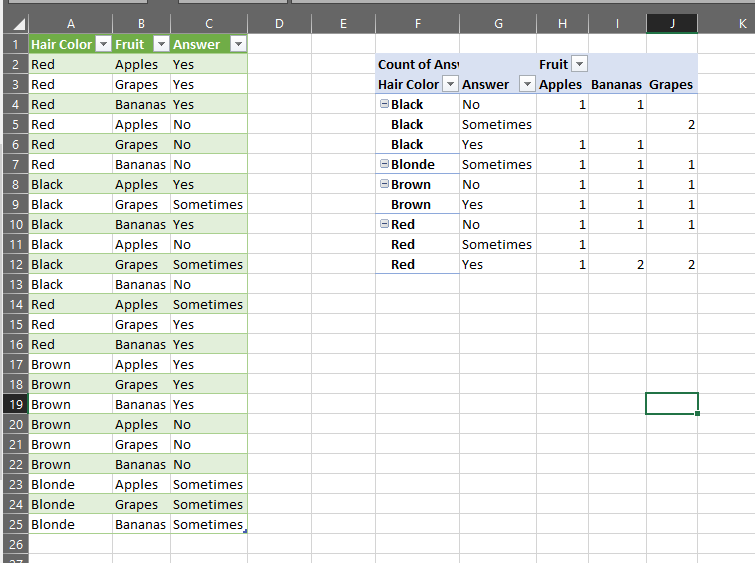
Excel Pivot Chart Multiple Columns 2025 Multiplication Chart Printable
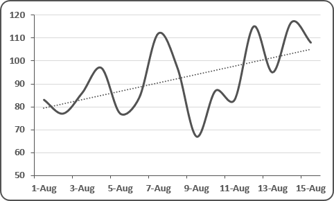
Excel Pivot Chart Trendline Across Multiple Rows Impactdamer


